In the last few years, there has been a shift in application and website design from 3-D and ornate to flat and minimal.
The trend emerged as a revolt against “skeuomorphism” – the design concept of making elements imitate their real-world counterparts. With the increased use of mobile phones and touch screen tablets, users began to prefer large, clear buttons to fake leather or wooden user interface controls. Just take a look at Apple’s shift from iOS 6 to iOS 7 for an example.

What is “skeuomorphism”?
A skeuomorph /ˈskjuːəmɔrf/ is a derivative object that retains ornamental design cues from structures that were necessary in the original.
Source: Wikipedia
All “skeuomorphic” really means is that elements use shadows, gradients, textures and ornate details to reflect the real world object they represent.
Examples
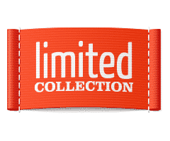
Subtle textures and gradients are used above to create a realistic fabric effect.

The shiny chrome style makes this icon resemble a real volume knob.
Advantages and Disadvantages
| Pros | Cons |
|---|---|
|
|
What is “Flat” design?
If skeuomorphism is “more is more”, flat design preaches “less is more”. Simplicity rules and content is king. Flat design elements are typically two dimensional, clean, and make use of bold colors.
Examples
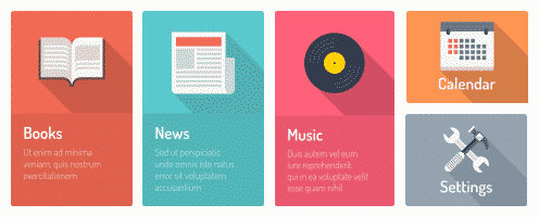
The elements above are minimalistic and use bold colors without gradients.
Advantages and Disadvantages
| Pros | Cons |
|---|---|
|
|
What’s your preference?
When it comes to attracting the right job seeker or landing that new client, which design style would you choose? There is no right or wrong answer, and there are no strict rules demanding to follow one style or another. While flat design is currently preferred by many, your company’s branding and the audience you are trying to reach will be two major factors in deciding on which direction to take. When flat design does suit your project though, the minimalism, bold colors and sleek typography can create a highly usable and enjoyable experience.
