


When you’re on an adventure, you document the highlights, the parts you want to write home about. Your eyes are no different. And with email? The more straightforward the path, the more rewarding the trip.

KISS: Keep It Simple, Sweetheart
You have an incredible opportunity. A sales pitch worthy of romantic prose, of write-ups of Homerian proportions. And you want your clients to read all about it and get on board. Rig up the email ship, load the whole presentation, set sail to inbox!
But wait.
Do you want to barrage your client with 10,000 lines of detailed information? Or would you rather entice them into following an interesting path of morsels into your idea, thus familiarizing them with the concept and opening their minds to involvement?
Newsletters, updates, congratulations, and other wordy undertakings are best left to a link to your website. The average person reading their email is not looking for a lecture, but a soundbite. What are you trying to say? Focus on it. You can always send more emails.
Less TMI
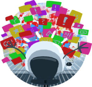
Ever clicked on a website to face a technicolor stew of popups plastering your screen? Where do you click first? Probably the back or exit buttons. Did you just lose respect for that site, or assume it was junk? This is a common reaction to too much information. Say it, don’t spray it! Keep your CTAs minimal and easy to find. A good email keeps the information (and interest!) flowing in order of importance- header, logo, imagery, the nitty gritty info, all sandwiched with a nice big CTA and some social media links.
Ooh Shiny
Colors rock. Use them to catch that brain’s attention… but don’t strain it. Keep colors harmonious, simple, unique and polished. The busier a correspondence, the less professional it will feel. It is currently en vogue to be minimal with color use, but consider some color to stand apart. Whatever hue you choose, carry it through the whole composition. You’re going for a cohesive, professional and clean look, jazzed up with your imagery and exciting message.
Bells and Whistles
You’ve seen it. The email that churns to life after loading for several seconds with gifs and backgrounds and ART poured into every pixel. It’s breathtaking but ultimately not that useful- much like a large fiberglass dinosaur on a road trip. However- Keep in mind that your beautiful creation, while functional on your spiffy top-of-the-line desktop or mobile device, will most likely not work on some of your recipient’s technological dinosaurs. Instead, these users will get a big beautiful error screen. Which leads us to another good practice: Simplicity is kind to those with disabilities. If your images do not load, your alt text will. Seek to provide the same experience for all. The less colors you use, the easier it will be to fall within the lines of ADA color contrast compliance.
Fonts of Knowledge
You don’t need to be a typography guru to choose a good typeface for your emails. When building your email, always test on mobile. Around 46% of users are seeing your creation on mobile. Sans-serif is recommended as your go-to for body font, and consider web-safe fonts for functionality across email platforms. If you find this to appear a bit too default and desire a flair for the dramatic, a bold display font will do. Design away! But remember, a user with shaky eyesight is not going to appreciate your deciphering your regency era calligraphic lettering as much as they would a strong, bold headline that they can immediately digest. The moment a user squints and goes “huh?”, you have lost their attention, and likely, business.

Cut it Out
As your eye finishes its initial journey around the screen and tells the thumb to scroll a little farther, it should feel as though the adventure is coming t
o a comfortable end. To scroll and scroll on one email out of the average of 126 daily correspondences flooding
the gates is simply not to be expected. In an effort to save unsuspecting eyes from such marathons, many email service providers clip long emails, or send them directly to the Spam folder. Remember, you’re motivating a response to learn more, to pique curiosity;
a one-two punch to action.
A focused message with great imagery, clean colors and a clear call to action button is the buttoned up professional feel you want to give your clients. Dispense with the fluff, and keep it simple.


