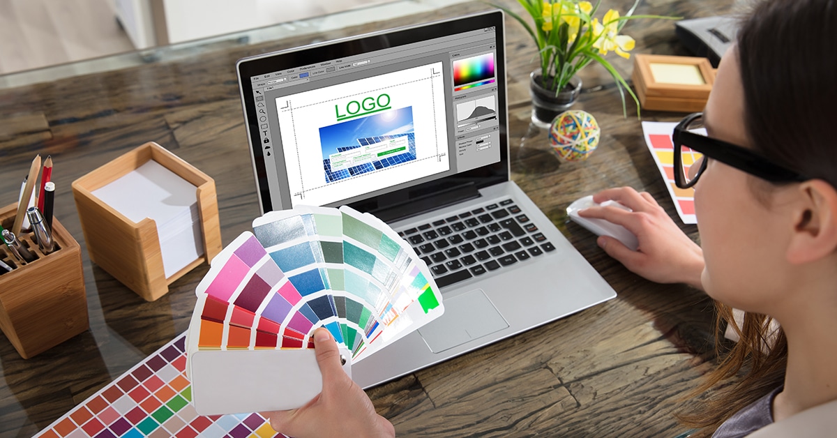
Need to spruce up your staffing firm’s brand image? If you’re considering a logo redesign, here are 5 trends to consider.
1. Geometric
Less is more but it has to be fresh as well. With the constant barrage of imagery and visual noise, vying for your attention, simplicity wins. But it has to be smart and original. Something that will quiet the noise but still catch your eye. Geometric flat shapes are coming back to counter last year’s 3D craze, but they will need to be unique or reimagined.

Gifted by Oké Design
2. Hand-drawn
With everything going digital in 2020: work, social lives, entertainment, conferences, therapy, appointments, etc. people are craving some human interaction. This applies to design as well. Drawing a logo by hand adds those imperfections that show us the people behind a brand. Hand-drawn logos are whimsical, feel one-of-a-kind, warm and approachable. Getting away from a screen to create it doesn’t hurt either.

Foxtail Plan Co by Prism Creative
3. Analogous subtle colors
Analogous is a fancy way of saying colors that are close to each other on the color wheel. Instead of bold and full of contrast, logos are trending towards harmonious. Also a sign of the times. We want more peace in our lives and less opposition.

Elephants Remember by Mike Jones
4. Gradients
Gradients soften things, make them flow and add some life or breath. Again, it isn’t a wonder that we want our designs to breathe more in 2021. Add them to a simple shape to give it some depth and airiness. Just be sure that it prints well! (Oh and use more of those harmonious colors from #3.)

5. Artistic Typography
Besides getting back to the basics and calming our lives, we also want to have fun. Often text based logos can feel a little limiting, but add some personality and they can communicate your brand instantly. Remember to prioritize legibility while still making things your flavor.

Yum Rum by Katrina Romulo
What we’re designing really reflects what we need from 2021.
- Simplicity.
- Humanity.
- Harmony.
- Breathability.
- Authenticity.
Yes, please.
