From the front page to team bios, your staffing firm’s website is likely to be covered in photography and naturally, you don’t want it looking like everyone elses.
A request that we commonly receive as part of the Creative Team at Haley Marketing is to make sure the imagery we pick doesn’t “look like stock photography.” It’s a little difficult to explain exactly what that means but odds that you can picture exactly what I’m talking about. It might be those photos of business people in crisp suits, crossing their arms and looking directly at the camera or that awkward shot of five people shaking hands and/or high-fiving simultaneously. Using photography that can be considered cliché makes it easy to take a project and turn it from something that’s head and shoulders above the crowd into something that’s lost in it.
As stock photography becomes more ubiquitous, you may start noticing the same stock faces appearing in a lot of different places. We joke about one model who has been a doctor, lawyer, construction worker, athlete, and everything in between. I personally have seen him on the sides of buses, in the subway, on packaging at the hardware store, and in a number of other places. My teammate, Natalie, wrote about options to get away from those same faces but what if you wanted to personalize it even more and provide your own photography? From photos of your office to the people on your team, it is certainly an option and can make your company’s website feel like it’s well and truly yours.
These are a few tips to help you take exceptional photos through better composition:
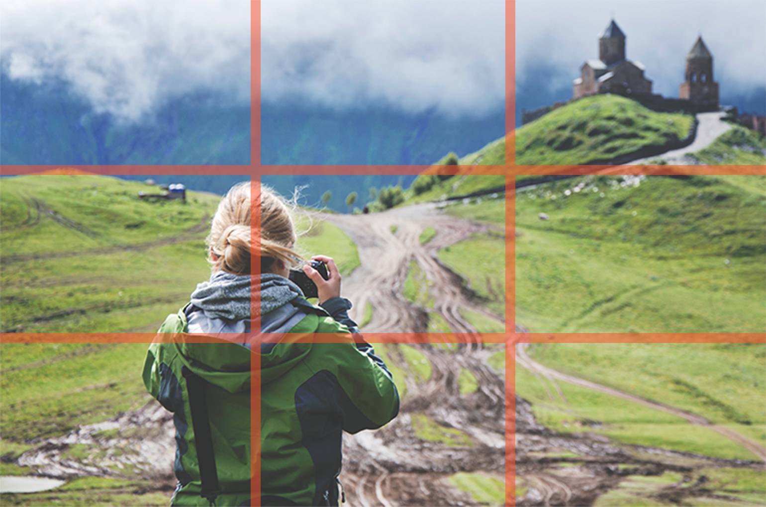
The rule of thirds:

Imagine a tic-tac-toe grid and think of where the lines intersect. Placing the main subject where these lines meet rather than in the center of the frame can help create a balanced and visually-pleasing composition while making the photo that much more interesting.
Leading lines:

The human eye wants to follow a path and you can use naturally-occuring lines to help lead it.
Negative space:

The subject of your photo should be clear and leaving negative space around it can help emphasize the main part of your photo. Negative space doesn’t have to be white but instead can be the sky, a colored wall, and more so long as it is immediately clear what the photograph’s main subject is.
Point of view:

Everyone knows what eye-level looks like because we can see it all day, every day. Instead, change up your perspective a little bit. Get low and close to the ground to give everythign a grander sense of scale or get higher up and give us a view from above.
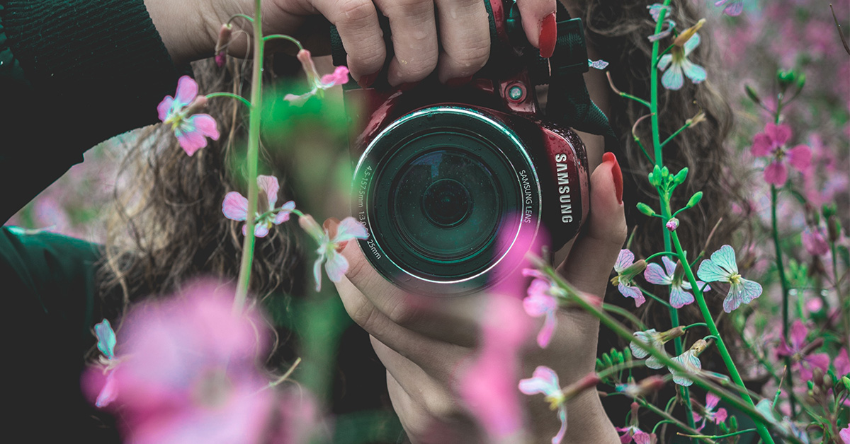
Depth of field:

Depth of field is the distance between the nearest and farthest aspects of a photo and how many of those objects appear as crisp or blurry. The shallower your depth of field, the more blurred the items out of focus will be. Depth of field is a great tool to isolate the subject and keep what’s important in focus (pun intended). Really shallow depth of field used to be only easily achieved through higher-end photo equipment like a quality lens with a large aperture but this is no longer the case as modern smartphones have made the effect available to everyone. Newer iPhone models come equipped with Portrait Mode while many Android phones have come with a feature called Lens blur for the last few years.


