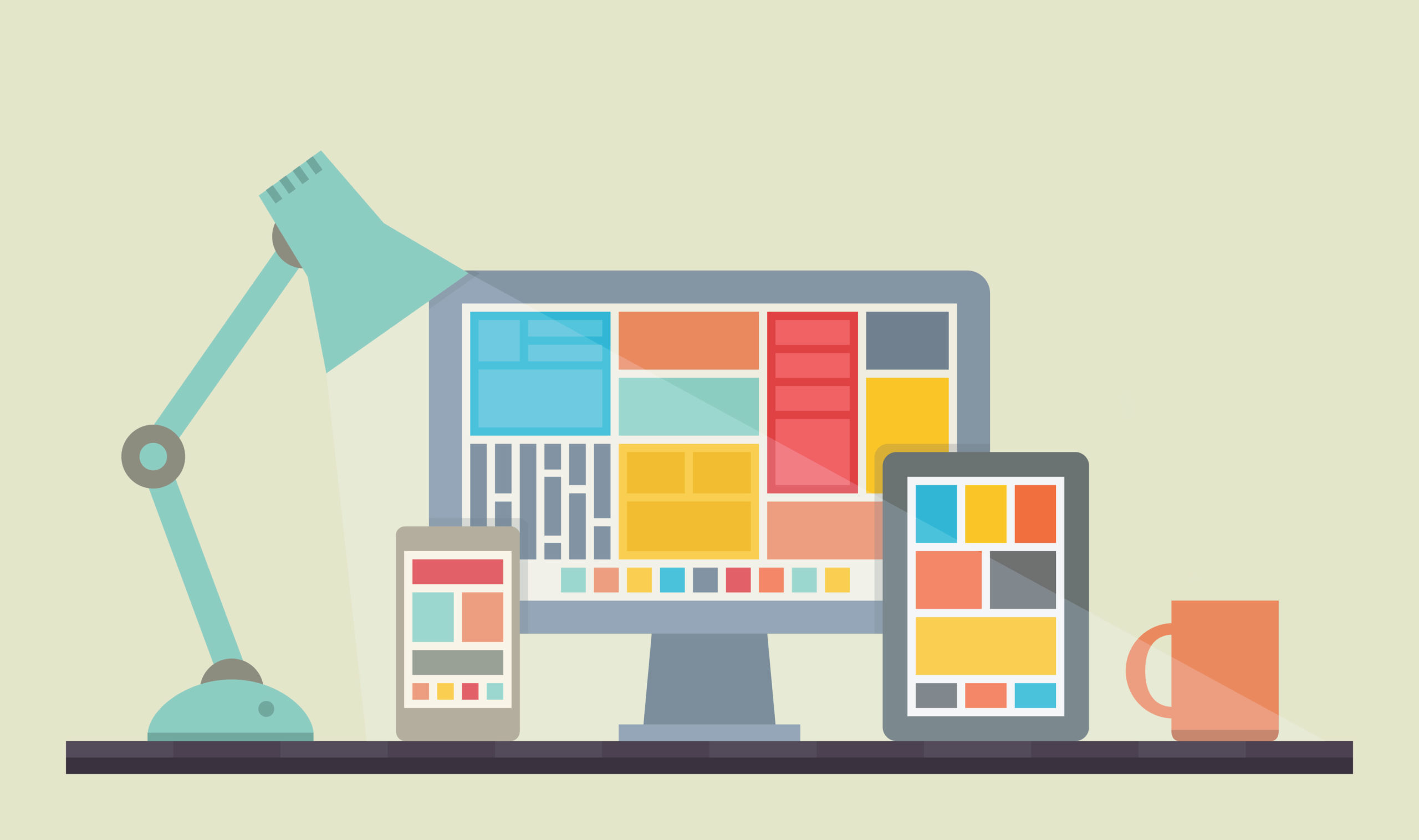
Your staffing company’s website is the digital heart and soul of your business. Whether you’re building a new website, updating your existing one, or if it’s been a while since you’ve visited your own site, here are 5 design tips to consider:
1) Use a strong header image.
The first image a user sees on your staffing website forms their first impression of your staffing company. This image should be powerful and offers the best chance at capturing a visitor’s attention. Think about what you’d like this image to convey to a visitor:
- What industries does your staffing company serve?
- What part of the country are you serving?
- What type of history does your company have serving the community?
These are all things that could be conveyed through the right image. You can also consider using a slideshow to display multiple images in rotation, or even a video.
2) Choose great photos.
While it’s been said many times that “content is king,” it’s also been said that “pictures say 1000 words.” By utilizing excellent photos and imagery on your website, you can quickly give visitors a glimpse into your company culture.
Stock photos are a great way to give a professional touch to your web presence, and are now more widely affordable than ever before. Take care to select images that don’t look outdated, and think about what each image says about your staffing company. If your budget allows, set up a professional photoshoot at your office to build a library of original images you can use on your website and in your future marketing efforts.
3) Don’t be afraid to use color.
Your company website is a fantastic place to increase your brand awareness, and that means using your corporate colors. But don’t stop there! Your website is also the perfect place to introduce some secondary and complimentary colors into your corporate identity.
4) Make sure your site is laid out in a way that is easy to follow.
Visitors to your website should not have to struggle to navigate your site. Choose a font that is easy to read and take extra steps during the editing phase to ensure your copy is short and direct. Place important items like job search buttons and calls to actions in easy-to-find places towards the upper portion of your site to entice visitors to utilize those functions. It should be easy to find your contact information and links to your social media accounts.
5) Avoid long lists & text when possible.
Utilize elements like icon boxes, charts, accordions and sliders to keep big lists of text engaging to your audience. Tying together images and text helps to make sections of your site stand out, and helps a user retain pertinent information.
Does your website need an update?
Start here!
Browse our portfolio of recent web projects for inspiration, or connect with a marketing educator today.


