With almost every update to your browser comes a host of changes that allow us web designers and developers to create awesome features for your staffing website. New bits of code become adopted and as old versions of browsers drop in use, they take the inability to use new code with them. It is because of this that the internet is allowed to constantly evolve and become so much cooler.
Email design and development, on the other hand, is a funny thing.
Like browsers, email clients can and do update what code will or won’t work for readers. Google, for example, announced last year that Gmail would finally accept the <style> block in the header which finally opened the gates for truly mobile-friendly emails in Gmail and Inbox, allowing us to change how we coded emails for the better. However, for every one of those email clients that allows modern coding, there is another email client who remains stuck in their ways and forces us to compensate for code that is, to cut a long story short, antiquated.
Microsoft is perhaps the most notorious for this (specifically on Windows machines) thanks to a decision made for Outlook 2007. In the previous version, Microsoft had used Internet Explorer for its email rendering which allowed for code which, at that point, was modern. For 2007’s version, the rendering engine was switched to Microsoft Word which meant an infinitely worse adoption rate for newer coding practices and a need to build emails using some very old-school methods.
With email, the more things change, the more they stay the same. The name of the game in today’s environment is to get your email to look good and work well in as many email clients as possible. That means designing and coding for as many different scenarios as possible. These are your staffing industry email design rules for 2017:
-
Keep it narrow.
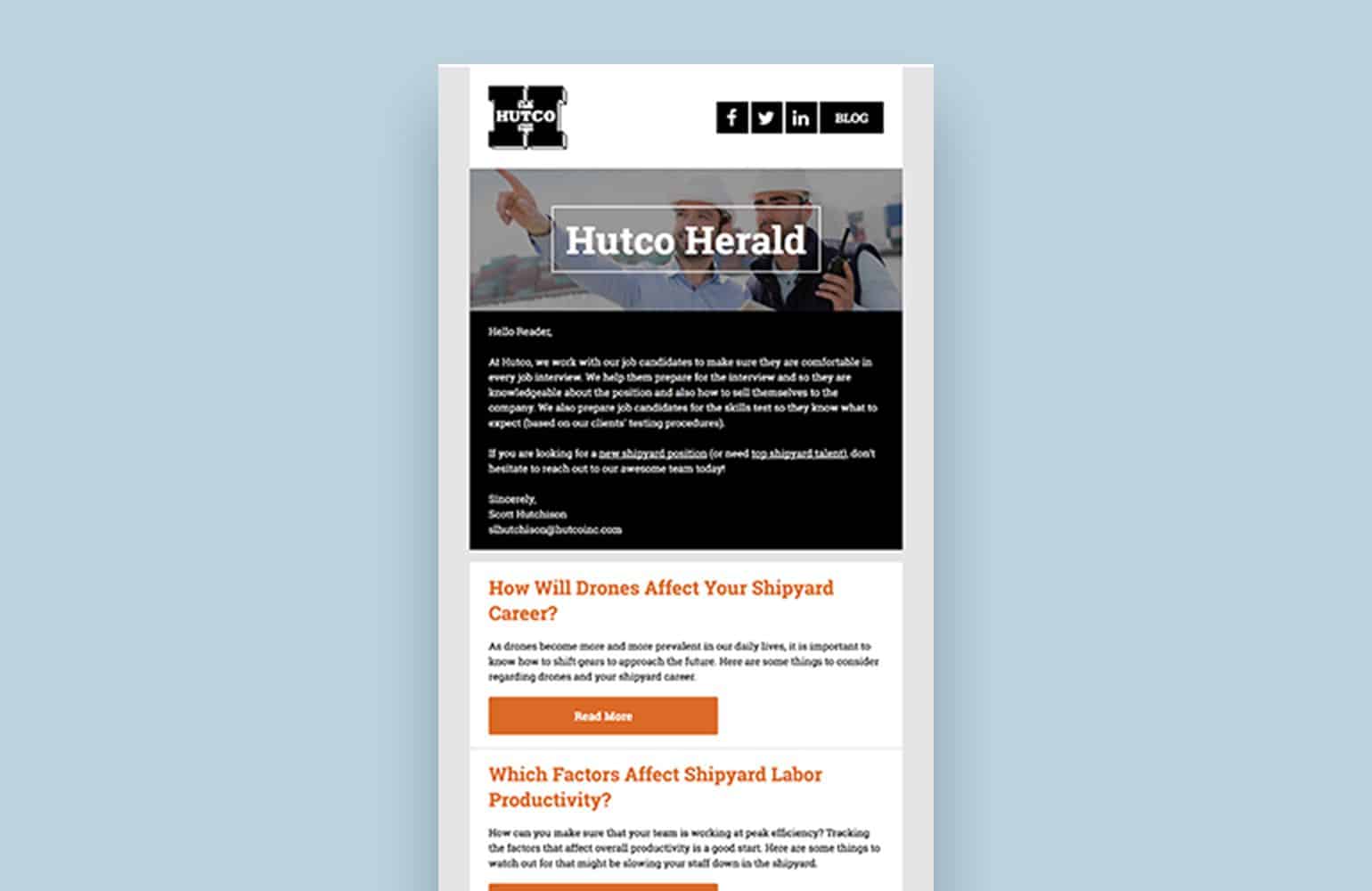
High-resolution displays are very in right now but the most popular desktop screen size is still 1,366×7,68 (for the sake of comparison, 4K displays, which are becoming more and more common, have resolutions of 3,840×2,160). In addition to that, many email clients have sidebars and the window may not be maximized to begin with. Because of that, we design the content area of our emails at a width of 680px. It’s wider than the tradition 600px but thanks to the wonders of responsive design, if the screen happens to be narrower, we are easily able to compensate.
-
Go wide.
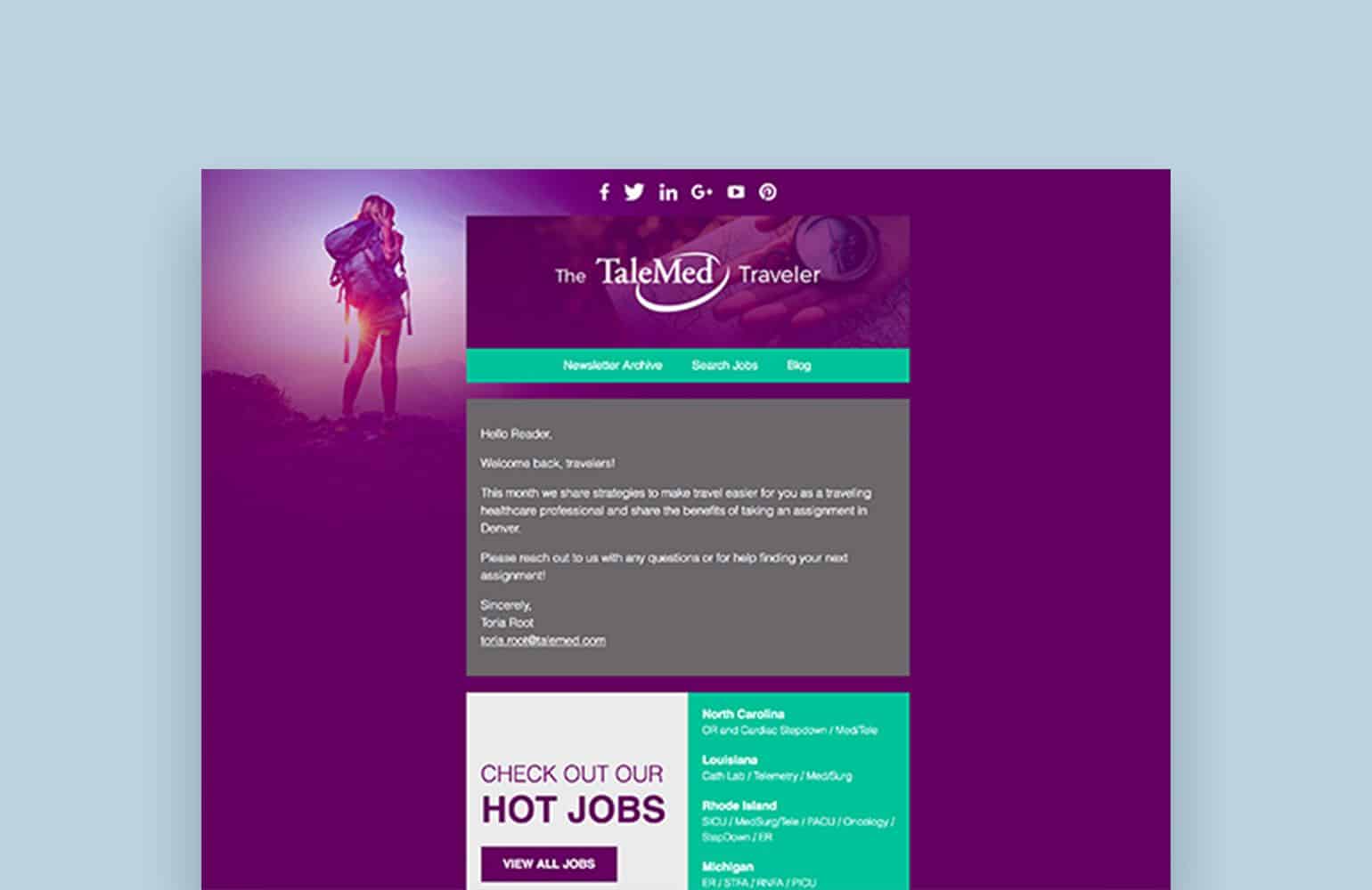
Just because your content area is relatively narrow, it doesn’t mean that your email as a whole has to be. It’s very easy to make an email feel cramped and claustrophic but it’s even easier to avoid that by using background colors, images, and spacing.
-
Breathing room.
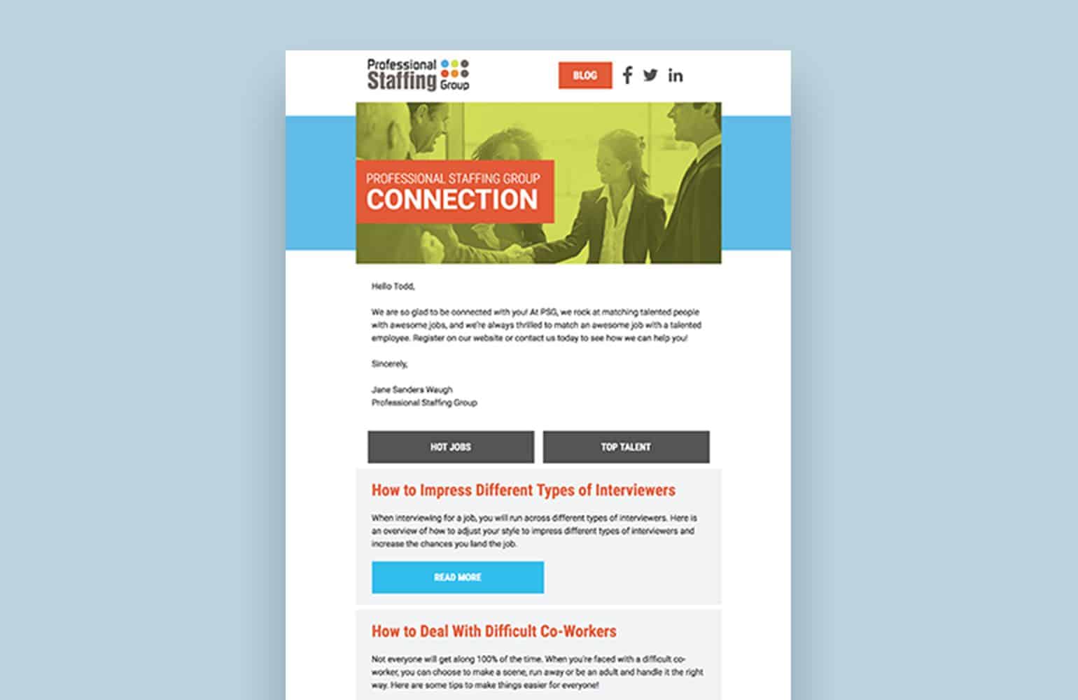
A surefire way to turn people off your content is by cramming it all together. Leading (the space in between lines of text) is an important tool in the designer’s kit and appropriate use of it can make large copy areas easy and enjoyable to read. You can also use spacing to differentiate between different content areas and keep readers from geting confused.
-
Draw the eye.
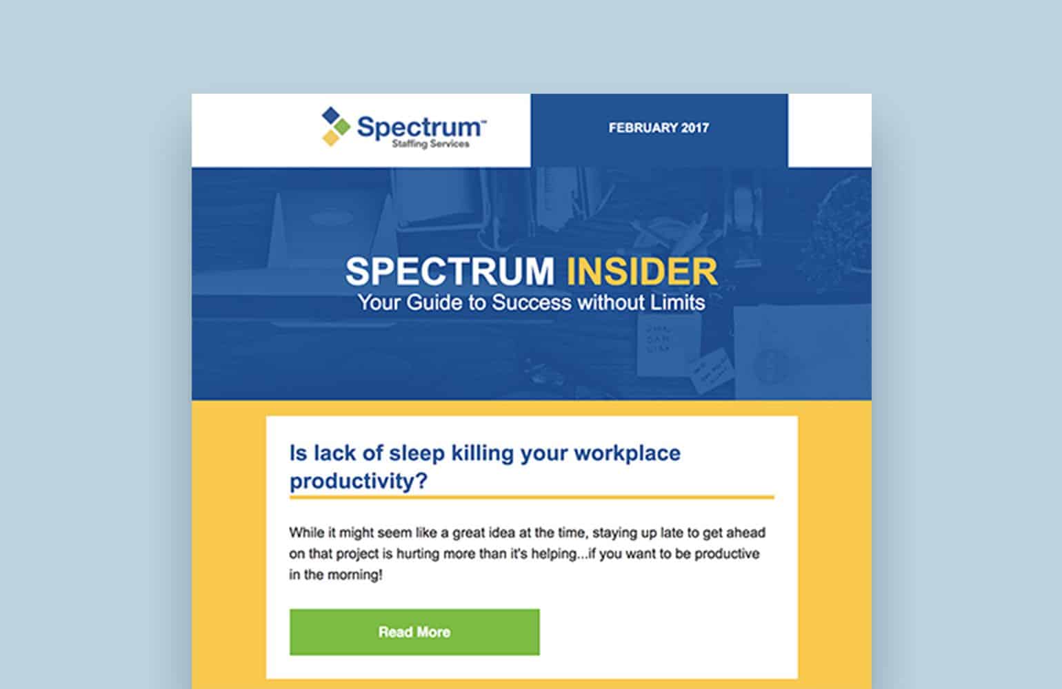
Visual hierarchy is so important. Through use of color, font size, and shape, you can direct where the reader’s eye goes in a natural way and lead them to the action (clicking a link, button, etc) that you would like them to take. Make the difference between headlines, descriptive copy, and buttons clear.
-
Mix it up.
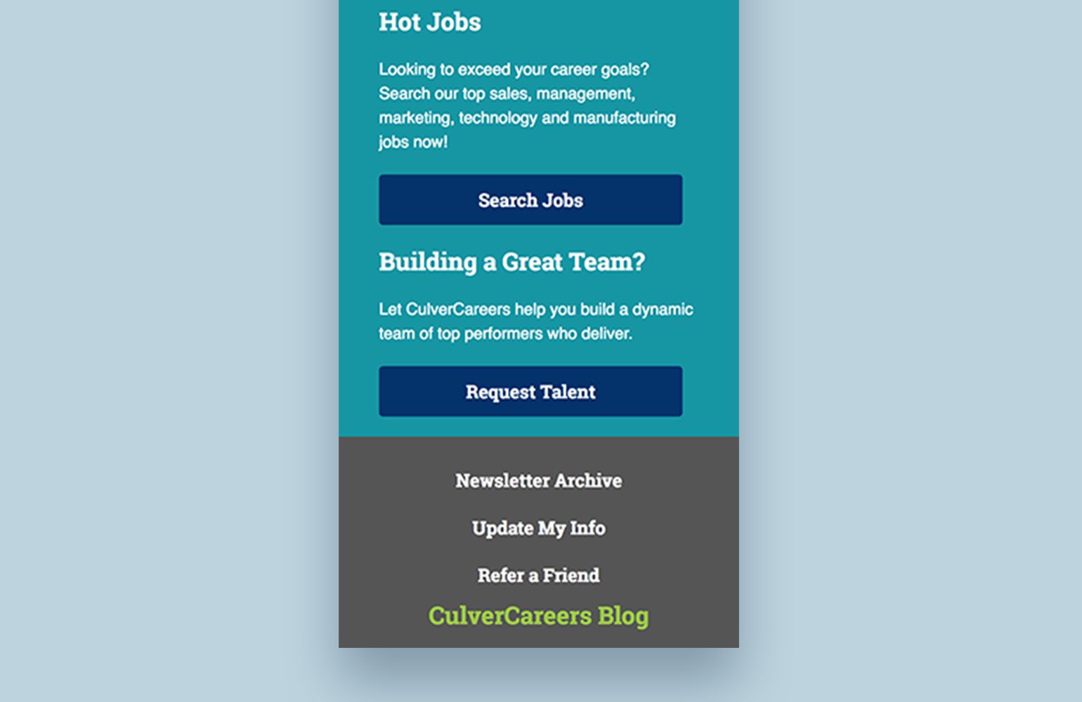
Your email shouldn’t be monotonous. Feel free to mix it up with different types of content and different sections in order to make it visually interesting and informative for the reader. This includes utlizing blog posts, hot jobs, featured talent, statistics, and more to keep both clients and candidates interested in what your company has to offer.

-
Mobile matters.
This statistic is going to be a little different for every sender and is entirely dependent on the audience that you are mailing to but a massive proportion of your email views are likely to from mobile devices. According to Litmus, at least 52% of the emails that they have tracked are opened on iPhones, iPads, and Android devices. Gmail does not differentiate between web and mobile views but they own roughly 20% of the market share and as of 2015, roughly 75% of Gmail’s 900 million users were using the service on mobile devices.
-
Be responsive.
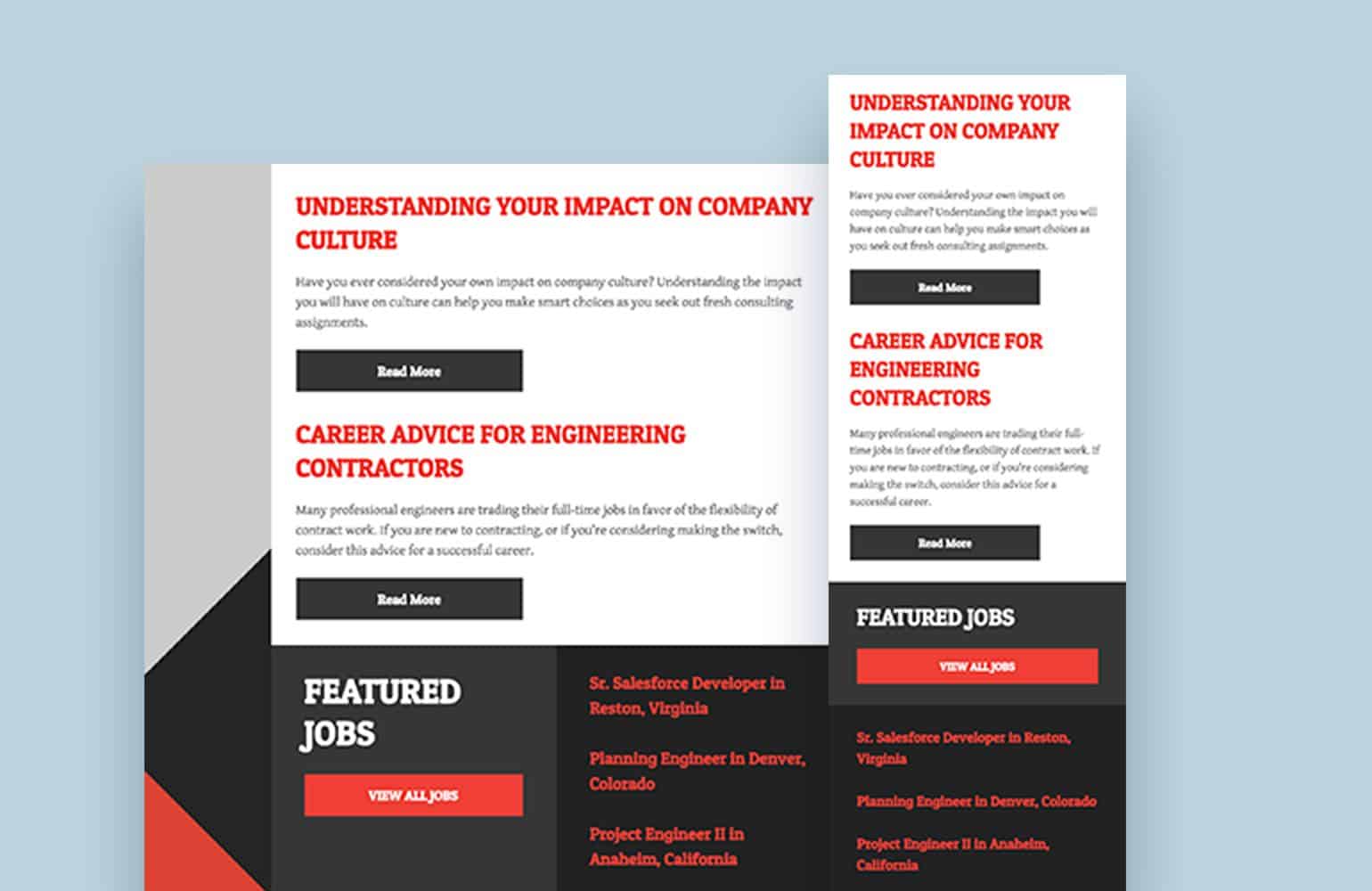
Thanks to the fact that mobile device usage is so high, we have to design for smaller screens. Phone screens will be narrower than the 680px that our desktop email sits at so we need to reconfigure the email when the screen width collapses. This is done by making content areas either span the full width of the container regardless of what size the screen is or by stacking rows and columns on top of each other to reflow how it all looks on mobile devices.
-
Bigger is better.
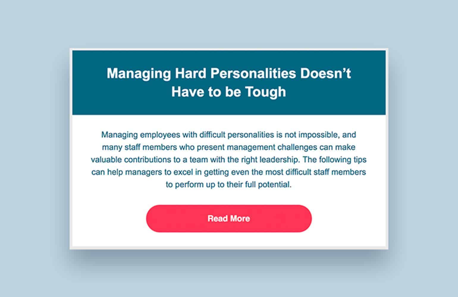
Making text easily readable on those smaller screens is easily accomplished through through larger fonts and larger buttons. When we design and build emails, our font size is 16pt at a minimum with headlines anywhere from 50% to 100% larger than the body copy in order to make the email easier to read. On top of that, you’re going to want your buttons to be big, bright, and obvious. It is important for them to be easily seen and clicked. Apple recommends that buttons should be at least 44px tall to make it easy for taps to activate them but you can always go a bit bigger to make it that much easier.
Designing for email is not easy but it is very much worth doing. A well-designed email can bring people in and keep them visiting your website. Email is also proven to provide great ROI. Most good things don’t come easy but good things are worth doing.


